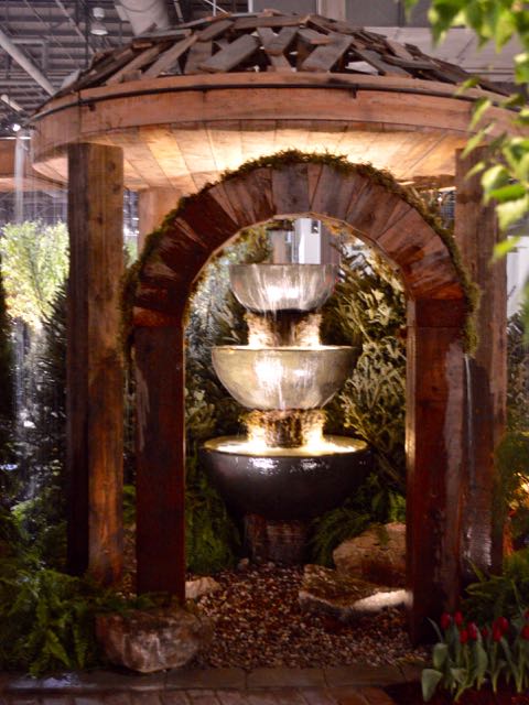
| The water garden from Genoscape won four awards at Canada Blooms in 2016: Outstanding Large Garden, Outstanding Use of Water, Best Overall Creativity, and Judge’s Choice for Garden of the Year. It was a standout. |
It’s the last day of Canada Blooms 2016. Many exhibitors told me they thought it was the best show in years. So I’m sorry that this is my first post – when you have mere hours to go see for yourselves.
Perhaps I needed time to think about what to take away from it. Plus, over the past week and a half (and longer, if you count the lag between blog posts), paying work has restrained me from the blog.
But now, having reflected on the show, a pattern has emerged: ain’t it wonderful what odd-ball things can inspire ideas! That’s the essence of creative thinking, right? Creative people connect things that haven’t been connected before – or connect them in novel ways. Here are three from Canada Blooms 2016. I hope they’ll turn on Aha! light bulbs over your head, like they did for me.
 |
|
Peer to the left, at the foot of that fountain pillar by the archway. Can you see a small, light brown pile of rectangles among the greenery? It’s a decorative ball, made of overlapping wooden off-cuts, that Genoscape principal Joe Genovese picked up at Winners and thought: That’s kind of cool. This became the design inspiration for his exhibit. See it reflected in the ball-shaped pergola? That random pattern repeats all through the garden. Incidentally, the pillar itself is composed of two inverted urns, stacked with a basin on top. See them? Try turning something you use every day (like a plant pot) upside-down or on its side some time. You might surprise yourself with what you can make of it. |
 |
|
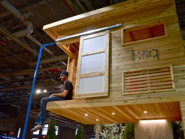
Here’s another idea from an unexpected source. B.SQ. Landscape Architects’ exhibit, called Nest, is an elevated playhouse above a sophisticated deck. The design won Outstanding Small Garden in 2016. And its shape was inspired, believe it or not, by the ostrich-legged AT-ST or All-Terrain Scout Transport thingies from Star Wars. Cool or what? Constructed of cedar over a supportive steel frame, the playhouse is strong enough to hold three adults. You’ll get a much better look at it here on B.SQ.’s website. I photographed B.SQ. landscape architect Robert Boltman taking a well-earned break the night before opening day. (Wasn’t fast enough to catch him sliding down the pole a few minutes later.) Boltman showed us the toy AT-ST that was the lightbulb for this concept. This kind of thinking is what you come to a landscape architect for. |
 |
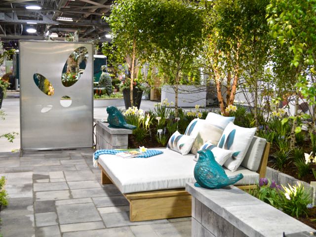
| Last, let’s look at this small contemporary garden from landscape designer Julie Moore, which won Outstanding Use of Innovative Elements in a Garden. Julie calls it the Stingray Garden, and describes it on her website. The inspiration sprang (sprung? springed? sproinged?) from a stingray-shaped umbrella shade. The colour palette derived from the grey, white and camouflaging turquoise polka-dots of a living stingray. She repeats the stingray shape in her plantings, and the pebbles in her water basin, below. |


