A Good Thing – Dramatic Entryway to this year’s Canada Blooms pictured above.
The Worst Things
1. The Trend of More Commerce than Art in the Showcase Gardens.
Traditionally, it was the showcase gardens that you went to see. Each had a distinct flavour, with memorable details and a definite personality. It was tough to decide which was the favourite, as there would usually be a couple of real standouts, or at least, a few really memorable features that stayed with you. Now, unfortunately, Canada’s garden tradeshow – for that is what it is really – is beginning to actually feel like a tradeshow, as more and more of the showcase gardens include obvious logos, promo materials, TV sets, and an emphasis on hard landscaping, and “rooms”, rather than gardens that transport you with their heart and soul.
 2. The Trend Duo of Ginormous Rocks and Massive Conifers Continues Apace
Not that I have anything against rocks and trees, I happen to love them, but this combination is becoming a Canada Blooms cliche, and the effect is often unnatural looking and just, like a great deal of Canada Blooms combos: simply ersatz. It’s also starting to seem lazy: One imagines the garden designer throwing up his/her hands and saying: just put some more rocks and pine trees in there and we can get out to the bar.
3. The Lack of a Cafe/Oasis on the 800, or Main Floor
It took us about 15 minutes to find a place and a chair for a coffee on Wednesday morning after our tour ended. In years’ past there has always been a section on the exhibit floor with tables, chairs and even umbrellas, that was a welcome oasis and place to have a breather. Eating/snacking places have all been moved to the other floors and some of these didn’t have enough chairs or tables. I was there bright and early on the first day, so perhaps the cafe situation might have improved on later days – the programme lists a Springtime Cafe and a Crocus Cafe, but neither were in operation on Wednesday morning – quite a downside to our visit.
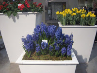 4. Lack of Additional Decoration
In past years, the garden design was all over, not just in the showcase gardens. As soon as you entered the auditorium you’d be met with dazzling creativity from talented designers: stunningly creative and elaborate displays at the escalators at the show entrance, and scattered all over would be tubs and planters with creatively designed plant material. At the show about 3 years ago, the displays around the escalators rivalled the best designs in the actual floral hall! This year, there were still the odd tubs scattered around, and while pleasant, they were fairly minimal in their impact. This lack must be due to the economy, as talented Canadian designers could have worked their magic again. I’m guessing that there simply wasn’t money for these extra installations. The lack of funds probably entered into many of the downsides to Canada Blooms this year.
5. The Fact that this Year is the Last Year at This Location
My tour guide in the morning let us know that, sadly, due to the skyrocketing rental costs, this will be the last year Canada Blooms will be held at the Convention Centre. It made this trip more poignant: The end of an era.
 6. The Morning After the Night Before
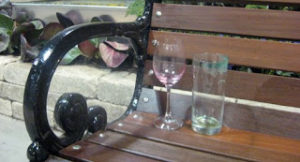
Remnants of the $195 Ticket Gala Left a Big Hole in the Exhibition Hall A large area with white tufted benches and elegant draperies swathed over the supports looked like a swell place to have a party; however, as an empty, unused space the following morning it was a bit of a dead loss. I kept looking at it and thinking, oh, that looks interesting, is it a cafe perhaps?, then remembering it was simply an empty area where they had the party last night. Discovering a couple of abandoned empty glasses left on a bench far away from the action, though, was sort of amusing.
 7. Land-Escape – Art Installation with Recycling/Landfill Theme
This garden was unfortunately billed as one of the Show Stoppers in the programme, and while it had some interesting points – like the melted plastic creations – overall it didn’t gel or work that successfully as either a garden or an art installation. It looked more or less like a truck had simply dropped off a pile of stuff on skids and left it there.
8. Two, count em, Two gardens that had tie-ins with major health concerns
Cancer Connections and the Heart and Stroke Pulse Garden.
While being healthy and bringing awareness to life threatening illness is an extremely worthy goal, I found nothing uplifting about a garden where I could get my blood pressure checked, or a garden with distracting large, albeit lovely, photographs of cancer survivors. The horticultural aspects of these gardens weren’t particularly memorable: there were lots of daffodils – surprise! – in the Cancer garden. At the risk of being a curmudgeon, (admittedly, these were sponsor gardens, not technically feature gardens), can we please make Canada Blooms about the garden? Being in a garden is health promoting enough, and save the health messages for other shows.
 9. We don’t need your stinkin’ logos!
This ties into point #1, and the above picture shows one of the worst offenders of this trend. This garden is listed in the programme as Simplicity – The Resting Garden. Hmm, let’s see: The birch trunks, check. The leaves, check. The mirrors, check. So far, fairly restful. The massive flat-screen TV fixed on the wall and the even massive-er 3D Logo affixed on the wall, not so much. An advertisment this is. A garden this is not. Bad, bad, trend. Altogether there were way too many flat screen TVs at this show, popping up in gardens everywhere.
10. Canada Blooms Programme/Guide Book
Confusing labelling, with numbers on illustrations not corresponding to the copy, and the choppy design left us often frustrated trying to find out what was what, or where we were. Main map on Page 22? Not very helpful. Combining the programme and the Landscape Ontario magazine into one, with each flip-flopped was a good idea though.
The Best Things
1. For the first time, a Children’s Garden that children could actually play in!
The Bienenstock Natural Playground This was one of the best conceived gardens, fun and enchanting. With its willow archway entrance, which had glowing lights underfoot, and various hands on activities including making bird feeder balls, assorted musical instruments, a stick-painting area and a big sandbox, it’s chock full of garden-y and arty fun. A delightful touch was a bright green plastic worm sculpture/fountain that you could “play” by covering the holes with your fingers.
We saw the beginnings of what is to be a massive sand sculpture which was looking very impressive by sculpture artist Karen Fralich. She will be working every day of the show to complete it, and it will cover many square feet.
Many children in this garden were having a great time: possibly the first group of children ever to come to Canada Blooms and be this entertained! The only downside to this garden might be trying to get your child to leave this one and come with you to the next.
 2. As usual, the designers from Jardins de Metis/Reford Gardens give us the goods.
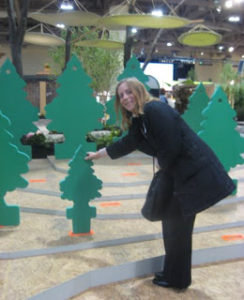
These garden designers from Quebec are always conceptual, fresh and witty. Their display this year used green foam trees shaped like old fashioned car air-fresheners, and matching slots in the floor. Visitors could grab a tree and make their own forest by planting it anywhere they liked. Fun for kids and adults alike. “Plant a tree because it is beautiful. Plant a tree because it smells good.”
3. The Speakers Series
These are always one of the best aspects of Canada Blooms, and always make your ticket well worth the money. If only it was possible to see the show, plus hear the talks from every speaker! They all sound intriguing and informative. An impossible task to hear more than one or two, and this year I heard Marjorie Mason talk about her garden which started out as a sand dune, and now is a water conserving delight. She is an expert on xeriscaping, and this year, I am definitely going to visit her garden near Uxbridge.
Wednesday was Organic Gardening day, and the other themes sound great too. Thursday: Design Day and Container Gardening. Friday: Scents and Sensibilities and Annuals. Saturday: Ecology day – Safe and Healthy Gardens and Sunday: Urban Gardening – Live Green Toronto.
 4. The Seasons Garden – The Real Thing
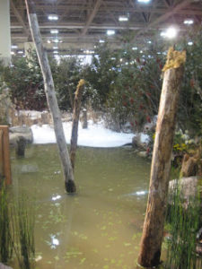
This garden was refreshing, showing a natural wetland throughout four seasons. No large rocks or massive pines were harmed in the process, but subtler plant material such as sumachs, teasel, grasses, horsetail and other natural wetland plants were expertly joined together to give one of the most realistic displays of a natural garden I’ve ever in at Canada Blooms.
I felt like I’d been transported 2 hours outside of Toronto to an honest-to-goodness wetland landscape. Refreshing!
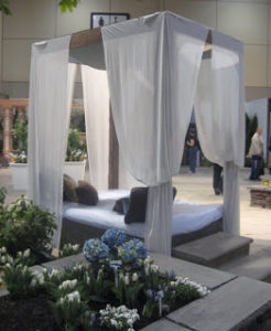 5. Fun Trend – Outdoor Full-Size Beds suspended on Ropes
This is a purely silly fantasy-element: something Canada Blooms in the past had in spades.
It’s a small design thing, and you’ll probably never have one in your garden, it’s totally impractical; but, when you see it at the show you just want to climb into it and have a nap, they look that inviting.
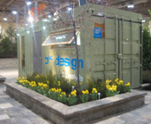 6. The Container Crate repurposed as an Office “Outside the Box”
This delightful exercise in recycling and re-purposing was a highlight. Created by b sq. landscape design studio inc, who specialize in “Container Architecture” the crate is now a working office with ladder leading to a roof deck. It’s made from the ordinary metal container crates that are used to ship over all those toasters and DVD players from China.
A whole new thought to how homes and offices might be created in the future. The crate itself costs about $2000 to start, and it serves as the shell for whatever is done to it afterwards. This particular office will have a permanent home on Queen St. East eventually.
Note: Yes, I do see that they have a logo on the side of their container, but it doesn’t take centre stage, it’s slightly obscured by the bumpy crate face, and their creation is so wonderful, I’m not deducting points.
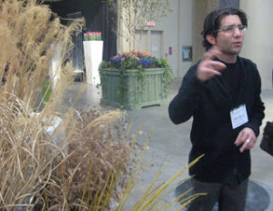 7. The Toronto Botanical Garden Area with Paul Zammit
Beautiful container displays, and the plus of having at hand the charming and engaging Paul Zammit, who is also damned knowledgeable and happy to give tips and information about everything in the booth, and more. We learned that the Oxalis in his exhibit are as easy to root as Coleus. He told us how, with a constrained budget, they managed to find creative ways to build their displays. Birch trunks, cut and linked together vertically formed the walls of their plantings.
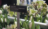 Grasses – the one in the picture has the added advantage of being gently musical when it waves in the breeze – and upright flowering “Ivory Prince” Hellebores were a highlight. Containers had a stunning array of lime green roses, chrysanthemums and the favourite (non hardy) plant at Canada Blooms this year the Kalanchoe “Lucky Bells”, with its lantern-like floral protrusions which hang down from upright stems.
 8. The Toronto Garden Club Horticultural Show and Floral Design
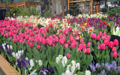 9. The City of Toronto Exhibit – for sheer profusion of flowers
For the masses of flowering bulbs in their plantings, a solid lake of tulips, hyacinths, and daffodils in undulating colours stretches out before you. As they grow all their own bulbs in Toronto city greenhouses, they have the ability to be lavish in their plantings. Photos of Toronto from long ago round out their exhibit. Cool to see pictures of Torontonians enjoying High Park in the 40s, as well as pictures of Toronto gardens in other decades.
 10. Maple trees in tubs, dotted here and there
I did complain above that most of the additional side plantings were fairly perfuntory, but this was a plus. This is the first time I remember seeing large-ish trees in these planters. Happily all these trees will find homes after the show is over in Downsview Park. Since these trees are already fully leafed out, they’ll sit out the spring in a warehouse after the show closes, then be planted in soil as soon as weather permits.
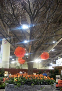 11. The massive oak tree with orange spheres
This 40 foot oak tree is the largest tree I’ve ever seen at the show, and I think it is the largest one ever used here. I can’t imagine how they got it in the doors. This Landscape Ontario exhibit showcases the landscapers’ ability to save mature trees when areas are zoned for new buildings. The process involves a period of root pruning to make the root ball a manageable size, allowing many mature trees to be saved and re-located when necessary. Good news for trees and people everywhere.
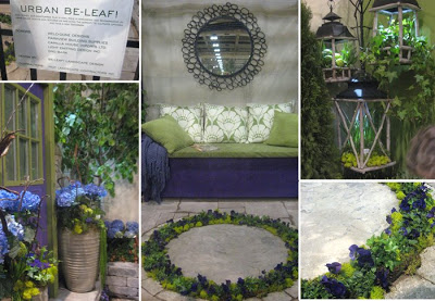 12. The Be-Leaf Garden
One of the smaller gardens, without even a write-up in the catalogue, but notable for its slightly impractical, but beautiful circular planting of violas in the floor, and for its overall loveliness. This garden had in spades what so many others lacked: atmosphere and cohesiveness. It made you want to walk into it in real life, to inhabit it.
13. The Entrance Garden
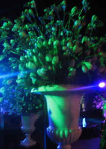 The Black Cube Very dramatic, and atmospheric, with stunning arrangements of white flowers and branches in white urns, lit by coloured spotlights. The multicoloured water jets were perhaps not working quite properly as we missed the “frothy mist” spoken of in the guide book.
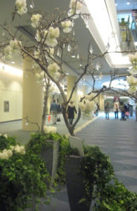 14. The Marvellous Tree at the Bottom of the Escalator
Standing in for the more lavish entryway decorations of old, this lone tree was nonetheless a really well crafted piece of garden design. The tree was possibly from an apple, very knobbly and gnarled. It was hung with crystals and glass vases of white hyacinths. Quite magical. Tree was flanked with vertical tubs planted with ivy and more hyacinths.
15. Label, label, label, label!
Plant material with labels Great to find new items, and to identify a particular favourite with a well placed label. Canada Blooms usually gets this very right, although attendees have been known to walk off with them. Bring a camera, or a pen and pencil, and leave the labels for the next person please!
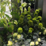 This picture shows the Kalanchoe “Lucky Bells” which was all over the place this year.
16. The smell in the air
Ahhhhh, the delightfully aromatic plant material: the hyacinths, the tulips, the odd pine tree, it all adds up to an olfactory spa-treatment. A welcome sensory input in Toronto in March. Almost worth the price of admission.
 17. The Volunteers
The volunteers really keep the place going, all working for nothing to put together this show every year. Our tour guide was one of these steadfast volunteers, Christine Kennedy, who is one of Toronto’s horticultural treasures. She works for the City of Toronto Parks and managed Allan Gardens for many years. Very knowledgeable and helpful. Thanks, Christine!



2 comments
Hi Sarah,
I enjoyed reading your best & worst picks. This was my first year attending the show, so I can't compare to previous years, which sound amazing! My mom shops at Mason Hogue and it's on my list this year after hearing Marjorie talk on Wednesday. And Be-Leaf was definitely the sweetest and most creative little space.
As a gardenning hobbyist, I found the Canada Blooms show 2009 highly overpriced, and extremely lacking in creativity and content. The items on sale and the displays were not different from what is widely available and seen at the typical garden centre, dollar store, health shop or even available at Walmart. Despite discounts available, the merchandise can often be found at cheaper prices. For an $18 admission price, the exhibit was relatively small and the lighting was lacking – making the ambience dark and dismal. Late on day 3 of the exhibit, the area was disorganized and displays were still being set up. Basically it is no different than having to pay a large fee just to enter a shopping mall. Umm, there was one freebie – a little homedepot shopping bag worth about 2 cents – too small for your future shopping needs!