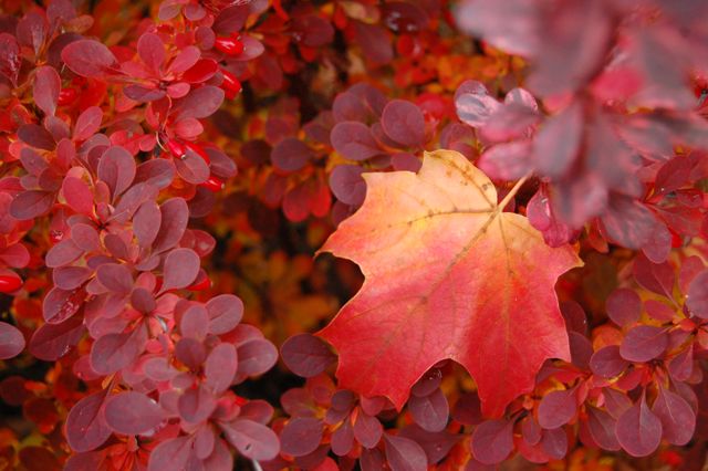
Naughty Berberis ‘Rose Glow’ in its brazen autumn garb, with a leaf in just the right place
While there’s no denying its scarlet beauty in fall, purple Berberis thunbergii or Japanese barberry is a shrub I can’t in conscience recommend due to the tendency of barberries to install themselves, uninvited, in wild spaces. Darn it.
However, this post is about colour, not conscience. And the issue I want to draw your attention to is the issue of neutrality… or how to use neutral colours in the garden to tone down heat such as red.
What is a neutral? It’s an unsaturated colour with a lower value or intensity. In the garden, grey often comes to mind. The examples I focus on here are cream or tan – a soft yellow or dull green.
Note how the creamy yellow in the sugar maple leaf attracts your eye and gives it a rest amidst the all-out red and purple foliage. It offers a small island of calm. That’s one of the benefits of a neutral.
In this outstanding Orienpet hybrid lily, see how the neutral cream border both accents and alleviates the intensity of the dark red petal centres? While a deep yellow trim would still have made a beautiful lily, the effect wouldn’t be as coolly elegant as this.
 |
| Lilium ‘Sheherazade’ |
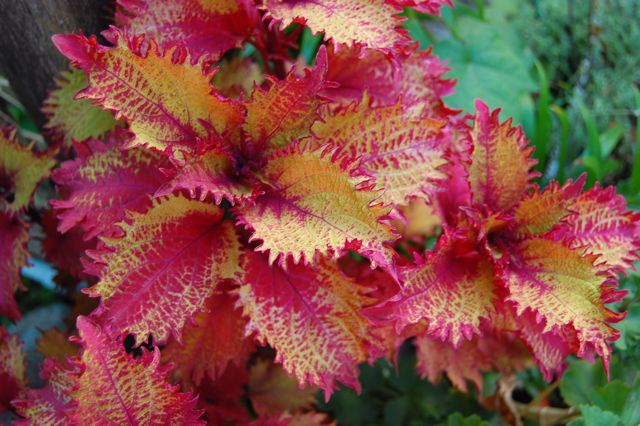
Here’s another instance where a neutral makes a strong colour less brash. It’s one of the newer, exciting coleus(eseses), Solenostemon ‘Henna’. Henna’s red isn’t strictly red, it’s a red-purple. But the centre of each leaf is a bronzy-yellow-green I’m calling tan. (In deeper shade, the centres are much greener.)
Tan or bronze is an interesting new foliage colour that is now appearing in plants such as the sedge Carex ‘Bronze’ or Heucherella ‘Sweet Tea’. With ‘Henna’, the neutral tan brings out the attractive serrations and the texture of the leaf. Although the tan covers quite a bit of the upper leaf surface, it still allows the red-purple to shine. In fact, I think it makes it richer.
 |
| Solenostemon ‘Henna’ is great in containers |
Hot colours advance, cool colours recede, and I find that neutrals occupy a happy middle ground, adding something to the overall texture of the garden.
You might have noticed that the proportion of neutral to intense colour grows in each of these images. The last shot is an inverse of the first, with a blush of red in a plane of straw-toned grasses and tulips. This spring bed at the Toronto Botanical Garden graduated in colour, from pale buffs at one end to intense reds at the other. It was a dramatic picture, and it gained at least some of its power from the subtle quiet in the neutrals.
 |
| Tulips in the Garden Hall Courtyard of the Toronto Botanical Garden |
It would be worth waiting to trim your grasses back in spring to get this effect. I love the linear texture of the grass repeated in the red striations on the tulip petals, don’t you?
For more ideas on neutrals such as grey and black, check out this Canadian Gardening article by Judith Adam. [Update: in 2016, Canadian Gardening is no longer being published] And here’s the link to Part 1 of our Toronto Gardens article on Cooling down the reds.


5 comments
You've done a great job on both Part 1 and Part 2. Kudos!
Working with color in the garden (or anywhere) is very difficult for me so I really appreciate beautiful and helpful posts like this one. I love that coleus and the tulips.
Thank you for this shock of colour on such a grey day! Spring couldn't look so sweet!
I'm distracted by the wonderful, beautiful, long stamens of the lily. The grass and tulip picture is lovely.
I've just messed up my spring by planting purple and white tulips. I can't imagine why I did it. I just did.
Esther
Thinking of my two favorite Torontoites… Torontoans… well, whatever, as the New Year approaches.
Happy, Happy 2011 to Sarah and Helen!!
(what is the correct term?)
xoxo
Alice