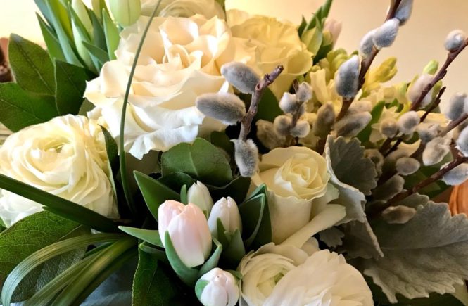
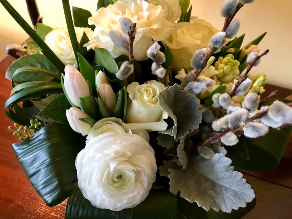
We’d come home exhausted after a day of loading and unloading furniture and boxes for our #1 Dot’s move to a nearby city (okay, it’s Hamilton). What was waiting for us on the porch but this beautiful arrangement.
As I turned it round and round to choose “the front*” it occurred to me that a well-designed floral arrangement can be like a garden in microcosm. What do floral designers play with but the same design principles we should all use when combining plants in our gardens, things like shapes, textures, and lines.
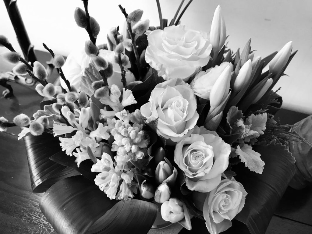
Turning the image above into B&W strips out some of the distractions. Can you see the juxtaposition of shapes? Two kinds of pointy tulips, the spiky lines of pussy willows, rounded forms of the roses, and fine jumble of the hyacinths.
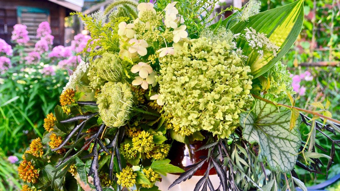
Sometimes I play a game with myself by substituting one plant for another. What if these were all shrubs, for example. The roses might be hydrangeas; the hyacinths, Deutzia. What might the others be?
That grey-leafed rosette of foliage could be a frosty blue Hosta. The tulips could be dense spires of white Veronica. What do you think?
Try this for yourself some day. It adds an extra layer to the pleasure of receiving a gift of flowers.
These, by the way, are by The House & Garden Co. on Kingston Road. They came as a combined congratulations and thank you gift from our real estate agent. Thank you, Lani!
*Some say that a good arrangement shouldn’t have a front and back. Do you agree?





3 comments
Interesting post. I’ve seen a lot of bad flower arrangements in my time. I think it’s important for people to understand what separates the good from the bad. There are certain situations where an arrangement doesn’t have to look good from the full 360. If the back won’t be visible (sitting on a hospital window sill, altar flowers for a funeral or wedding come to mind) then a front-facing design is a perfectly reasonable choice. These could save the sender a bit of money since not as many flowers are needed.
Good points on the back-to-front issue, Christine. By the way, my “can we substitute” game also works with plants we can’t grow in Toronto and vicinity.
That’s a really beautiful arrangement — talented florists!
I totally agree with you that floral designers and garden designers have links not just in palette, but also in shapes and form. I love using that black and white technique to help folks think about design in their gardens.
Like Christine, I’ve seen lots of unattractive flower arrangements (as well as unattractive container plantings, too). And they can be one-sided, too, depending on their location.
I like the substitution game, too!