There’s never a good time for a bad cold. But when it’s Canada Blooms, and you have a whole bunch of volunteer stuff to do, garden writer events to attend, plus pictures to take and thoughtful* posts to write? Well, ah-chooey!
For better or, more likely, worse, here’s my viral or virusy view of this year. (*Doing my best to think with a brain at the end of a long, snotical mile.) You have the weekend to see for yourself – may you do so in the best of health!
Thought #1: Flower folk understand a “theme”
Every year, Canada Blooms gives its feature garden designers a theme to inspire them. Most years some go for it and some pay it lip service. By contrast, floral designers – professional and amateur – understand what a theme can do: provide constraints that can boost creativity.
This year, the “Oh, Canada!” theme celebrates the 150th anniversary of Confederation, and the floral artists were given the added spin of “Coast to Coast.” Here’s how they had fun with it:
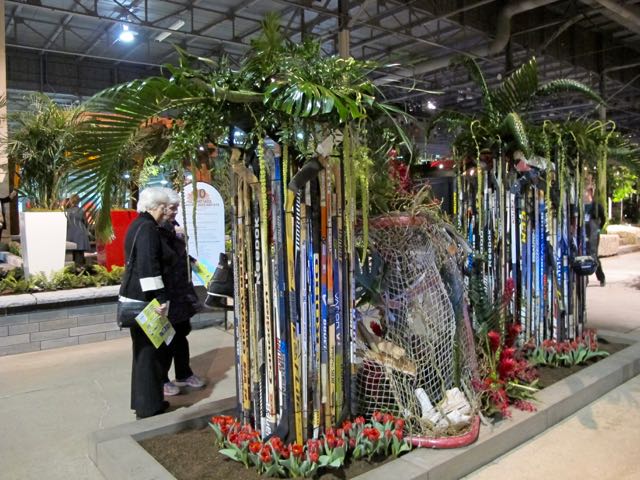
At any time, cursor over small images to see captions or click any image for the slideshow. Images will enlarge and sharpen in slideshow view (yay!) but you won’t see captions (boo!). Such is life and WordPress templates.
Why do flower people understand themes so well? Because, when they compete, they have tough judges who hold them to rules. As pretty as a floral creation might be, as amazingly well executed in our unschooled eyes, a floral design entry must interpret the category theme or risk winning nothing for all that hard work.
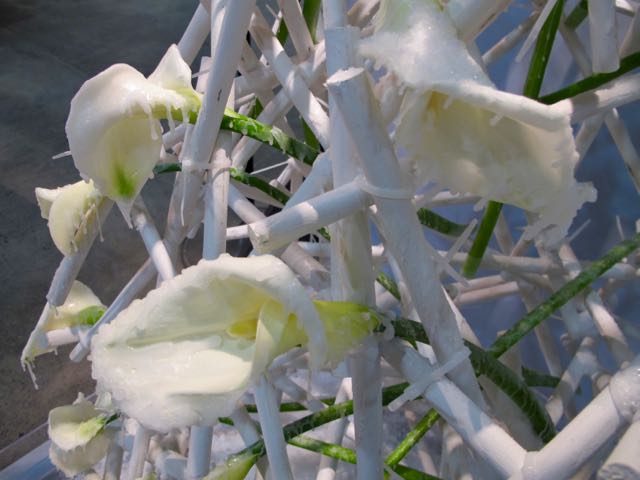
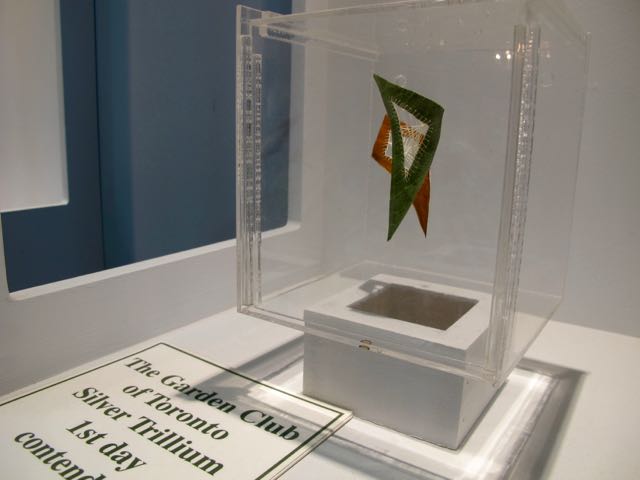
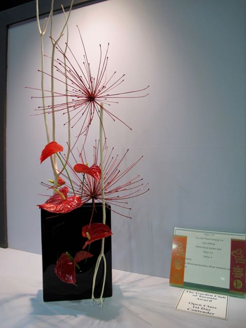
From my flower arranging days, I recall the ultimate put-down from a floral design judge, “That’s not a design, it’s an arrangement.” To illustrate, here are some designs from the Toronto Flower Show, themed on Canadian song classics.

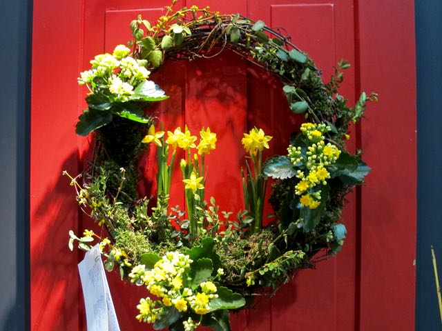
Thought #2: The little guys take themes seriously
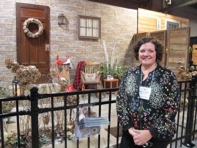
Let’s make lots of room for first-time exhibitors designing small-space gardens. They have to figure out how to make a tiny, tiny budget stretch a long, long way, the ultimate in creative problem solving, and tend to honour the brief.
What could be more Canadian than the winter landscape we stare at for too many months of the year in most of Canada? I liked Down2Earth‘s 150-square-foot front door design for its realistic approach to a small city garden, using dried Hydrangea with Hellebore planted at their base. She even snipped Bergenia leaves from her own garden to beef up the plant material in the bed behind her.
Thought #3: There’s room for controversy at Canada Blooms
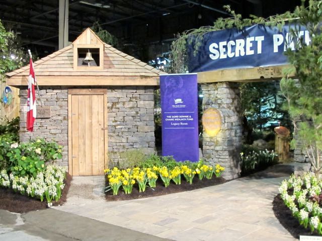
One of the first gardens to visit is Genoscape’s, themed on Gord Downie’s The Secret Path and the tragic story of Chanie Wenjack. I thought it was brilliant and timely, but was surprised to hear someone suggest that showcasing one of Canada’s failures had no place at a show like this.
Wow. To me, it’s the perfect place to challenge our thinking, open our eyes, and get us talking about this important aspect of Canadian history. It’s also a well executed garden. Win-win.
Thought #4: I like to see they’re thinking
Here’s a mostly pictorial tribute to some gardens I feel took this year’s theme to heart. For example:
Canada by rail
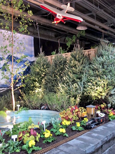
Designer Connie Cadotte of Garden Retreats did her research. Where would Canada be without the rails linking us from sea to sea? Against a backdrop of the Rockies, her whistling Canadian National train – borrowed from a model railroad club – was a fun attention-getter. And, shades of Alberta beef, my stock tank love affair continues with the idea of sinking one into the ground as a pond.
The Canadian Shield
Canadian Shield is also the name of the new hardy rose introduced this year by Vineland Research.
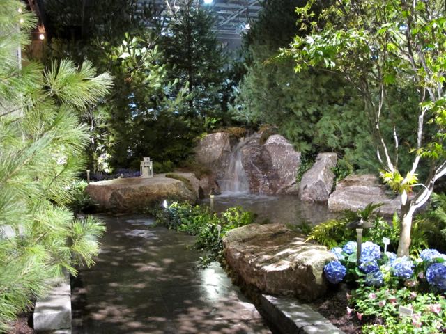
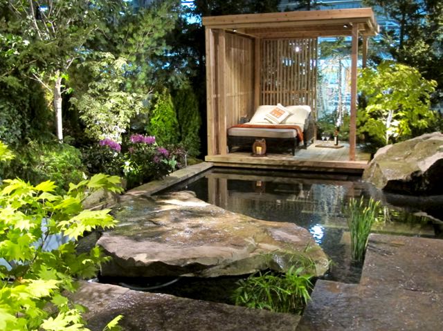
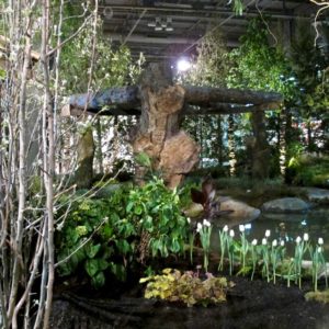
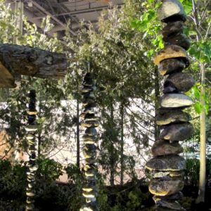
Plus, landscape designers do love using big hunks o’ rock (yes, it’s the technical term) to represent our Canadian Shield-y and/or Niagara Escarpment-y environment. These are nicely done.
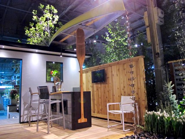
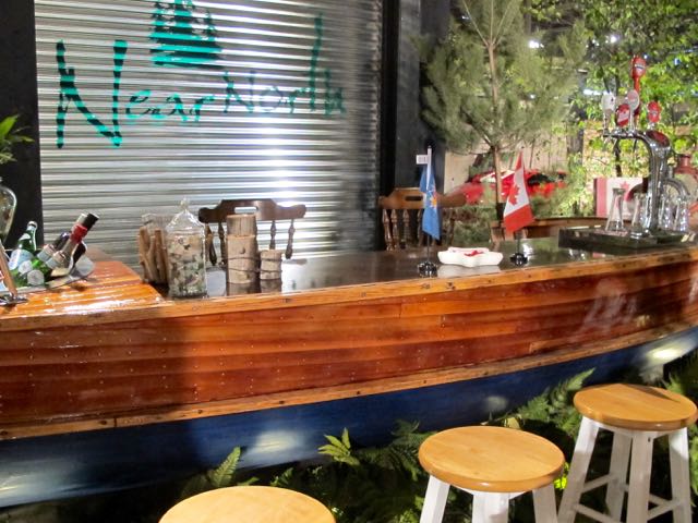
Does this float your boat?
We also saw a few water-worthy Canadian accents at Canada Blooms this year.
Let there be music
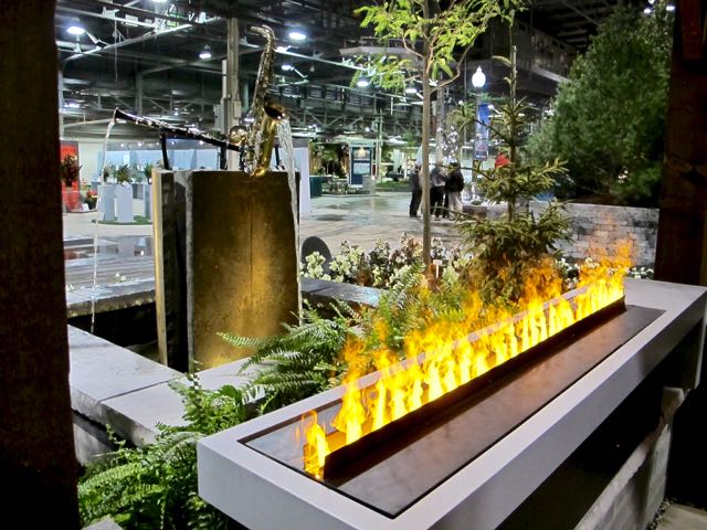
Music (and comedy) is one of our exports. In my not-very-clear photo, you might make out the wind-and-brass-section water feature that played across from all those flowery songs at the Flower Show.
Weather or not
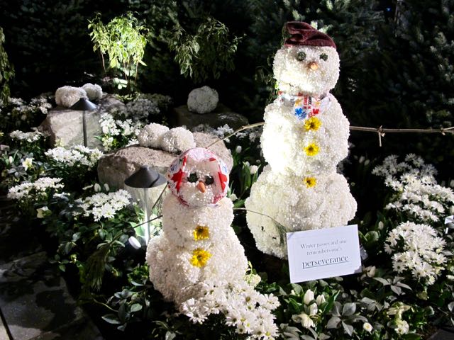
Well, wherever we are, we all have weather. But Canadians can be obsessive about it, especially when tantalizing spring suddenly turns back the clock into winter, as it did last week.
Niagara Falls
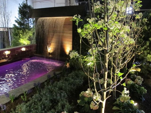
Slowly I turn. Step by step, inch by inch… and I see two Niagara Falls-es at this year’s show.

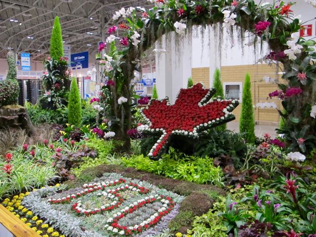
Maple Leafs Forever
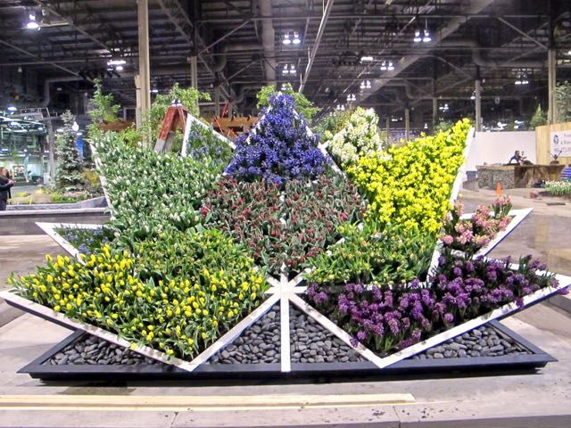
Admit it, Canada’s maple leaf is a star as a symbol. Many of the gardens found ways to include it. We started this post with the entry garden designed by Jennifer Harvey, with Vineland Research and the kids in the enlightened high school horticulture programs in the Niagara Catholic School Board.
And, as we began, we will… leaf you.
If you go, let us know what you think of the show. No rhyming necessary.







4 comments
Wonderful virtual tour! I see you got a pick of the candle waterfall in action – brilliant. Next year, I’ll be planning my day a bit better…and hoping for slightly warmer weather as well – I was afraid my live plants wouldn’t survive in the car so I ended up leaving earlier than I would have liked to.
Thank you so much Helen. Having missed your tour last Saturday because I slept in, I’m planning to attend on the last Sunday. With your kind virtual tour I will be much more enlightened for the real tour. May you be really feeling better.
That is your viral tour, not virtual.
Thanks for the tour!