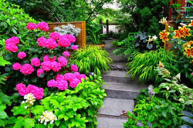
| Colour as punctuation: a bold blast marks a point of entry and
online pharmacy buy levitra oral jelly with best prices today in the USA
a transition between levels |
Bet you’re as fed-up-to-the-teeth as we are with February 2015’s relentless, white-on-white colour scheme. Let’s think colourful thoughts, shall we? Have a looksee at the inspiring ways this Portland garden has used colour – Colour! Remember what that is? – to try in the (hopefully) near future.
 |
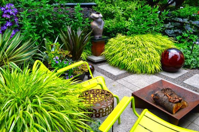
| How’s this for a utility area? This is a bl
online pharmacy buy aurogra with best prices today in the USA
ast of colour, for sure, but good planning means it holds together. |
 |
| For example, when I look
online pharmacy buy erythromycin with best prices today in the USA
at how colour elements are placed in this design, I see many interlocking triangles like the ones I’ve drawn. It moves my e buy chloroquine online innomed.net/literature/info/Europe/pdf/chloroquine.html no prescription pharmacy
ye around the composition yet creates a sense of balance – even with a bright palette like this. Try it yourself now with buy super kamagra
online pharmacy buy female viagra with best prices today in the USA
online innomed.net/literature/info/Europe/pdf/super-kamagra.html no prescription pharmacy the picture just before this one. How many triangles (or zigzags) do you see? |
 |
| Colour echoes: the blue star-shaped grass picks up the blue Saturn rings in the glass birdbath. Same colour, different texture. You could do this with plants as well. |


10 comments
I love your analysis of the color here. I always benefit from a different eye on things and you've opened mine – again!
Oh, Jane, thanks so much. We saw many beautiful gardens in Portland. Sometimes it takes me a while to process what I've learned.
A great summary. I was struck by the way plants and furniture were matched in Portland
Yes, me, too.
Just today I was dreaming of a dedicated utility area, I love the one in this garden.
Thank you thank you! This is exactly what I needed during this dreadful cold spell!
Hi Helen,
ahh, colour in the garden. A faint memory from last fall, thanks for reminding us what will be around the corner.
Colour therapy, much needed during this brutal February!
What a wonderful post! I am looking at my white car now and thinking that perhaps I need a different colour one.
OMG, All that color is making me dizzy. Just beautiful! I think I need a more gradual reintroduction, though, after this color-starved winter! -Jean
This is lovely! Thank you so much! Great photographs and wish I had the designing eye of the gardener, too.