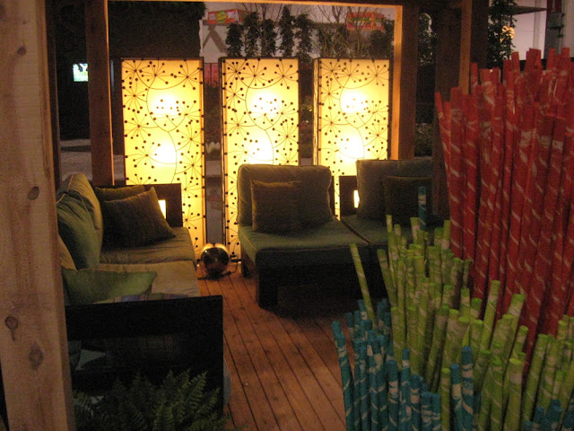
| Canada Blooms 2010: Reford Gardens always has an individual, witty display. |
Some in the online garden community are talking about Garden Show Letdown. I’ve got to admit that, of late, the magical effect of our annual show, Canada Blooms has waned. I never miss it though, as it’s a desperately needed green shot in the arm, and there is always something worth seeing. Below is an overview of last year and what to expect for this year.
Last Years Lows:
In years past, exhibits were often so enchanting that you didn’t mind (that much) lining up to walk through. That was in Canada Blooms heyday— I call it The Golden Age of earth inc—the landscaping company whose feature gardens at Canada Blooms were breathtakingly creative, whimsical, and unforgettable. They knew how to create a magical garden space. Earth Inc stopped exhibiting several years ago, and their unique presence has been sorely missed.
Sadly many so-called “feature gardens”, while still well designed, are there to showcase products: garden furniture, barbeques, stonework, gazebos. Beautiful stuff, but the display is more of an outdoor-room home show than a garden show.
 |
| Landscape Ontario’s jazzy outdoor room featured what looked like giant Pixy Stix. |
arketplace and Lecture Halls Location is Problematic
bits, making each less unique.
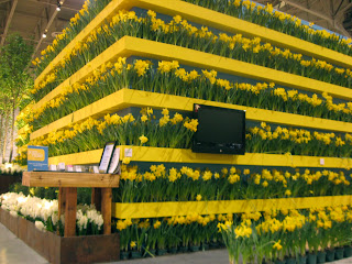
Two years ago, I actually complained about their garden, saying it was too much public service announcement and not enough garden. In 2010, the Cancer Society garden blew me away with its brilliantly poignant concept and artfully simple execution.
The rectangular block of daffodils planted in stripes cont
ained an inner memorial hallway with slate walls where visitors were encouraged to write perso
nal messages about their loved one’s struggles with cancer. It brought tears to my eyes. As a matter of fact, I’m going to save a whole post for this garden, which you can read soon.
The outdoor parking lot directly across from the building is easy to navigate. Washrooms are more convenient, and easy to find. People with strollers or wheelchairs will find the show on all one floor helpful. Snack/restaurant areas were easy to get to, if a little unimaginatively presented last year. Maybe this year it will be a bit peppier.
 |
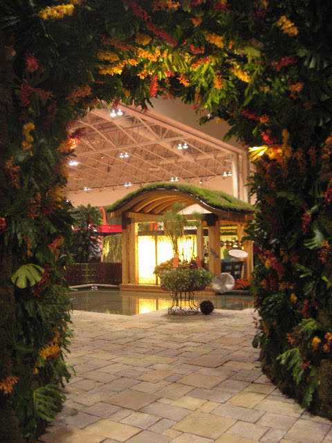
| Dramatic green archway planted with exotics. Landscape Ontario |
What will it be like this year 2011?
This year’s theme is Rhythms. The show is helping to celebrate Canada’s Music awards, The Junos, with Juno Rocks feature gardens based on songs, operas, or tunesmith’s garden inspirations. One is a tribute to jazz pianist Oscar Peterson. A curious concept and it’s making me go hmmmm.
There appears to be a bit of a back to nature feel going on with many of this year’s feature gardens, according to the website blurbs, with focuses on green roofs, water conservation and urban forests. Add a little bit of “slowing down”, a couple of Zen gardens and for a dash of arty fun, the always creative Reford Gardens. Plus, the amazing sand sculptor is back in the children’s garden. I’m looking forward to the show. If nothing else, the Garden Club’s horticultural exhibits and wildly colourful floral design is always captivating. The speakers and talks are often a highlight. And plus you can’t beat that divine smell of growing things.


8 comments
I saw the promo for Canada Blooms and it sounds pretty good this year, but all promos if they are done well, make you want to attend. Well, hopefully the gardens are worth the trip.
Helen, Our local garden show has dwindled over the years to a not very interesting product showcase, with few bright or inventive notes, as well as few plants! The economy has a lot to do with it, I suppose. I do love your first shot – magical display!
Ours has dwindled to dead! Sponsorship goes to sport, and no one will sponsor a garden show. They battle to get sponsorship for Kirstenbosch to go to Chelsea each year.
Ours was terribly disappointing to me! Although, I read two reviews and I wondered if we attended the same show! The outdoor rooms that make sense in California are ridiculous in Nashville where mosquitoes rule from April until the first frost! But, they were everywhere with enough manufactured stone to pave one of our major roadways! I love the moose! gail
This will be my first year – even if it is less spectacular than others I think I will be fully enjoying myself.
As an advance view from my preview today, the show is smaller, but there are some very nice gardens. Not so many "adventures in hardscaping". The gardens are a little more intimate, and that makes them a little more human. I'm hoping that people will go, because unless we support our garden show, there won't be a garden show. We'll post a more comprehensive review later.
Nice photos,Helen ! The show looks stunning, although the goofy moose was a bit "out" :-). I am a huge fan of gardening shows, they always give me new ideas how to arrange my own garden. I am really looking forward to your Cancer Society Garden post.
I will surely see canada blooms next time.I love gardening so much and searching new stuff and furniture for my outdoor.The captures shared in the post is very beautiful.