| Papaver orientalis ‘Beauty of Livermere’ is an astonishingly red red*. |
Our grey-day colour series continues with red. A
craving for red seems to be programmed into our red-blooded DNA, especially at this time of year. And this red is pure Santa-suit, Rudolph’s-nose, holly-berry red – the red that seems even redder when paired with its complement green.
So, given the almost-winter chill, why talk about cooling red down? And what does this unabashed blast of colour have to do with cooling, for Pete’s sake? Hang in and see.
When gardeners put red with other colours, they usually go for intensity. Intense contrasts such as red and white, or red and and its triad blue… or red, white and blue! In analogous palettes (analogous colours are the ones closest together on the colour wheel), red is often thought of as going with colours on the hot side. Think of a tropical red, orange a
nd yellow garden, for instance.
But this analogous pairing, red and purple, is another thing. It’s a Red Hat Society combination, the one the poem tells us “doesn’t go.” I happen to love it. One of the reasons is that the blue pigment in the purple moves the palette towards the cooler side of the colour wheel. It cools down the red.
 |
| Red in the Echinacea disks echoes the red Monarda flowers |
The colours in the picture above are analogous, too. But the mauve-pink in the Echinacea petals have been dialed back by the addition of white. Mauve is a tint or tone of purple, created by adding white or grey, respectively. The white in bot
h also cuts the heat, while the red in its intense pure form as well as in the mauve gi
ves this analogous colour key a pleasing sense of unity.
 |
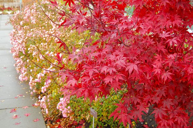
| Red Japanese maple, very likely Acer palmatum ‘Bloodgood’, with a pink polyantha rose that looks like it could be Rosa ‘The Fairy’ |
Okay, scale back the intensity. The pink in this sweetheart rose doesn’t contain a hint of blue, but the white tint is cooling. I find this monochromatic red-pink pairing to be refreshing; warm but without a furnace blast; a gentle contrast. Of course, the complementary green leaves contribute strongly to the picture.
If you’re interested in experimenting over the dark months, you might like to visit colour palette generator sites like COLOURlovers or Color Scheme Designer. While some of the colours on these sites aren’t ones you’d find in nature, they let you play around, unleash your wild side (with no repercussions) and simply get a sense of what works, what you like and what you don’t.
Go ahead. Light a fire under your imagination… even if you don’t care for the colour red.
Our series on Cooling down the reds continues here.
(*If the picture at the top looks familiar, it’s because this cultivar of poppy is on my Lust List.)


2 comments
I like the color combinations you showed. I tend to pair reds with purples and blue/greens in my garden, too. I think red and white is a bit too harsh.
A very interesting post! I never thought about it in that much detail but I do really like the combination of red with purples/pinks. The red/white/blue combination does not appeal to me at all but maybe that is because living in the US, whenever I see flowers of those colors planted together I cannot help but think that the planting is intended as an excessively cutsy patriotic tribute.